

Understanding color is essential for drawing students, as it can greatly enhance the visual impact of their artwork. This guide will cover the fundamentals of color theory, color mixing, and practical applications to help students make informed decisions in their artistic endeavors.
## 1. The Color Wheel
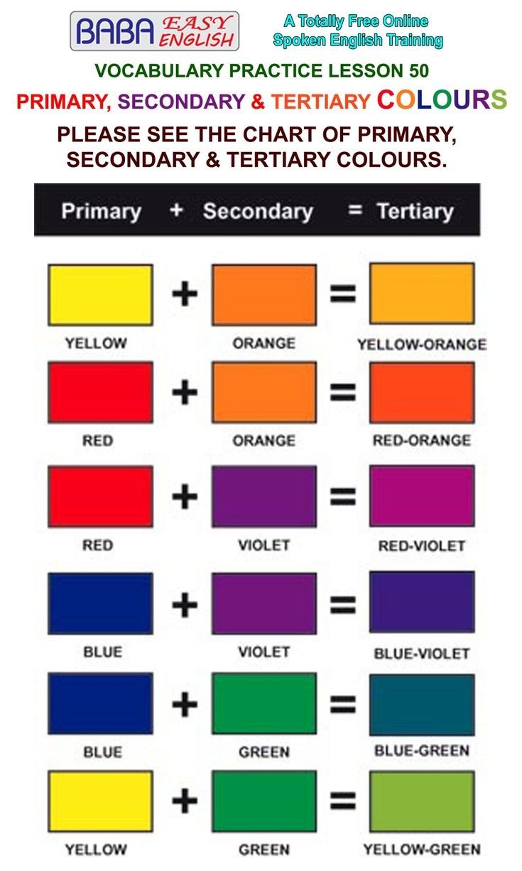
The color wheel is a visual representation of colors organized in a circular format. It is a vital tool for artists. The primary colors—red, blue, and yellow—are spaced evenly around the wheel. From these colors, secondary colors are created by mixing two primary colors:
- **Red + Yellow = Orange**
- **Blue + Yellow = Green**
- **Red + Blue = Purple**
Tertiary colors are formed by mixing a primary color with a secondary color, such as red-orange or yellow-green.
## 2. Color Properties
Ft ji j
Colors have three main properties that every drawing student should understand:
- **Hue:** The name of a color (red, blue, etc.).
- **Saturation:** The intensity or purity of a color. Highly saturated colors are vivid and bright, while unsaturated colors appear more muted or grayish.
- **Value:** The lightness or darkness of a color. Adding white creates a tint (light) while adding black creates a shade (dark).
Understanding these properties allows for greater control and expressiveness in art.
## 3. Color Harmony
Color harmony involves the arrangement of colors to create visually appealing combinations. Here are some common types of color harmonies:
- **Complementary Colors:** Colors opposite each other on the color wheel (e.g., red and green). When used together, they create contrast.
- **Analogous Colors:** Colors next to each other on the color wheel (e.g., yellow, yellow-orange, orange). When used together, they produce a serene and comfortable design.
- **Triadic Colors:** Colors that are evenly spaced around the color wheel (e.g., red, blue, yellow). This scheme provides a vibrant palette while maintaining harmony.
## 4. Color Meaning and Emotion
Colors often evoke specific emotions and can convey different meanings. For example:
- **Red** is often associated with passion and energy.
- **Blue** conveys calmness and stability.
- **Yellow** is linked to happiness and optimism.
Understanding cultural context is also important, as colors may carry different connotations in different societies.
## 5. Practical Color Mixing
When working with paints, students should practice color mixing to achieve their desired hues. Here are some tips:
- **Start with the primary colors:** Use these as the base for creating all other colors.
- **Experiment with mixing:** Mix small amounts of paint on a palette to determine the resulting color before applying it to your artwork.
- **Consider the drying effects:** Acrylics may dry darker than they appear when wet. Test your mixtures to avoid surprises.
## Conclusion
Embracing the fundamentals of color knowledge can significantly influence the quality and effectiveness of your drawings. By mastering the color wheel, recognizing color properties, understanding color harmony, and exploring color meanings, students will enhance their artistic expressions and develop a more profound connection with their work. Remember, practice is key—so don’t hesitate to experiment with colors in your drawings!

